om een gepersonaliseerde navigatie te krijgen.
om een gepersonaliseerde navigatie te krijgen.
- Als nieuw markeren
- Als gelezen markeren
- Bladwijzer
- Abonneren
- Printervriendelijke pagina
- Ongepaste inhoud melden
Salarisdossier 2020-07 EN
- 0 Antwoorden
- 0 kudos
- 838 Weergaven
Modified and improved
Changes in the user interface
Why
In the March release the user interface of Payroll File - and My File - was changed to match it with other modules in Youforce, such as Home and Flex Benefits. This month also HR Self Service will update the user interface, and gradually all modules in Youforce will apply the unified user interface design called Nordic Cool. Based on the feedback of our users, small changes will be applied to improve the user experience even further. In this release the font has changed and some colors were adjusted to improve the readability.
How
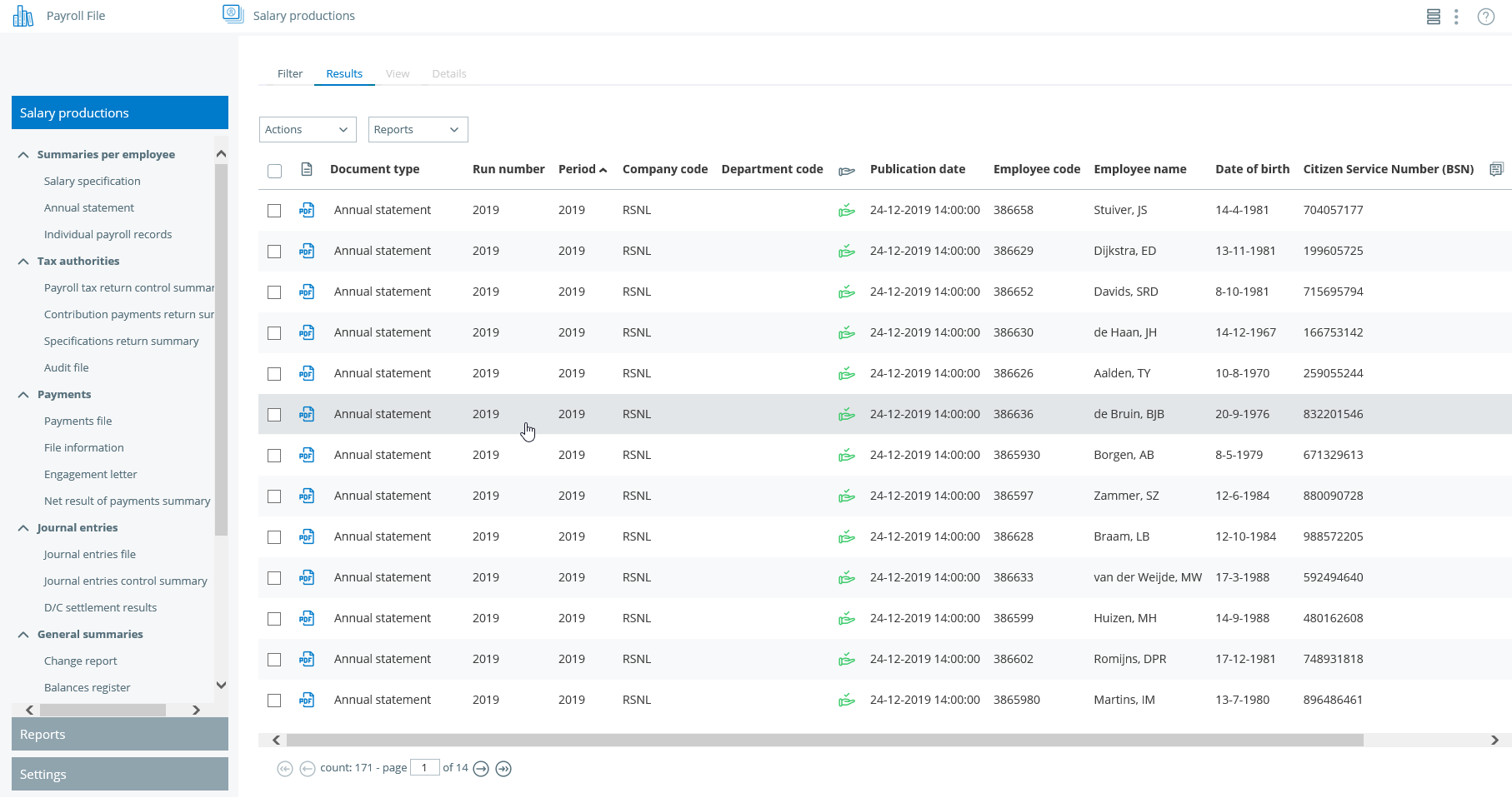
After opening Payroll File or My File the menu bar now has a light grey background, and the active menu item has a blue background. This way there is a clear distinction between the menu and the tabs and the active menu item stands out. Also the icons of the document format are shown in blue and the lines in the Results view have an alternating background now:

This new user interface will provide the same functionality as the old user interface
Your action
All users of Payroll File and My File will automatically get the new user interface after the release.
Publishing Date : 6/23/2020
Over Visma | Raet
Copyright 2019 Visma Community. All right reserved.
