om een gepersonaliseerde navigatie te krijgen.
om een gepersonaliseerde navigatie te krijgen.
- Als nieuw markeren
- Als gelezen markeren
- Bladwijzer
- Abonneren
- Printervriendelijke pagina
- Ongepaste inhoud melden
Performance Management 2020-10 EN
- 0 Antwoorden
- 0 kudos
- 730 Weergaven
Modified and Improved
Performance Management new look and feel
Why
After Home, Self Service, Dossier, and Flex Benefits now also Performance Management gets a new look and feel
How
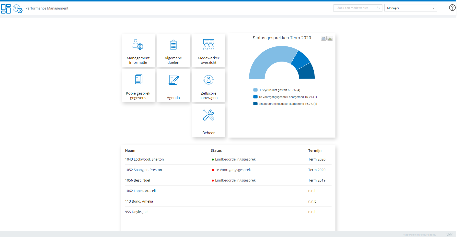
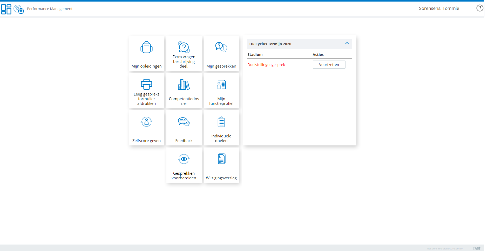
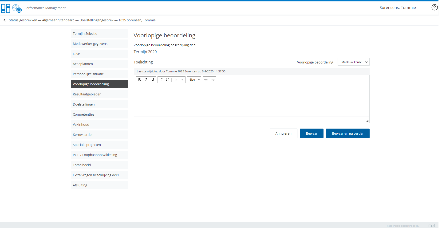
With the upcoming October release, Performance Management gets a new look and feel. The functionality will remain the same as before presented with a more consistent layout, font usage, and color scheme. These user interface elements will be more aligned with our other apps which already received this new user interface. Next to this, we added a small number of usability improvements like the use of text on specific buttons instead of the use of outdated icons and a wider review cycle widget for better readability (see screenshots below under manager and review cycle)
In a nutshell, the following changes will be noticeable:
- New fonts for all screens.
- The new color scheme throughout the application.
- Reduced white labeling for better consistency with other Youforce apps. The top line in the application will adopt the main white labeling color.
- All popup and confirmation screens have been redesigned with consistent layout and text on the buttons instead of icons.
- New design for all used icons and tile images
Remark: Starting with the October release, you will have this new interface to your disposal. You do not need to do anything, it will be implemented automatically.
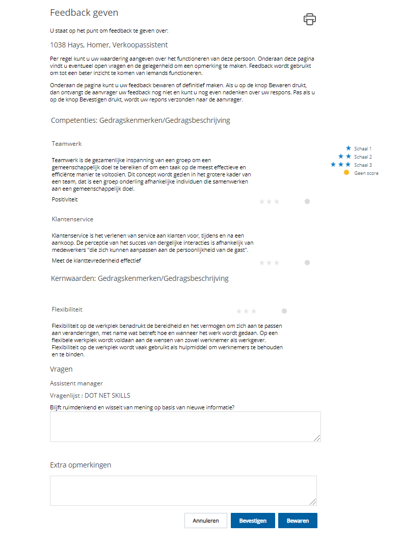
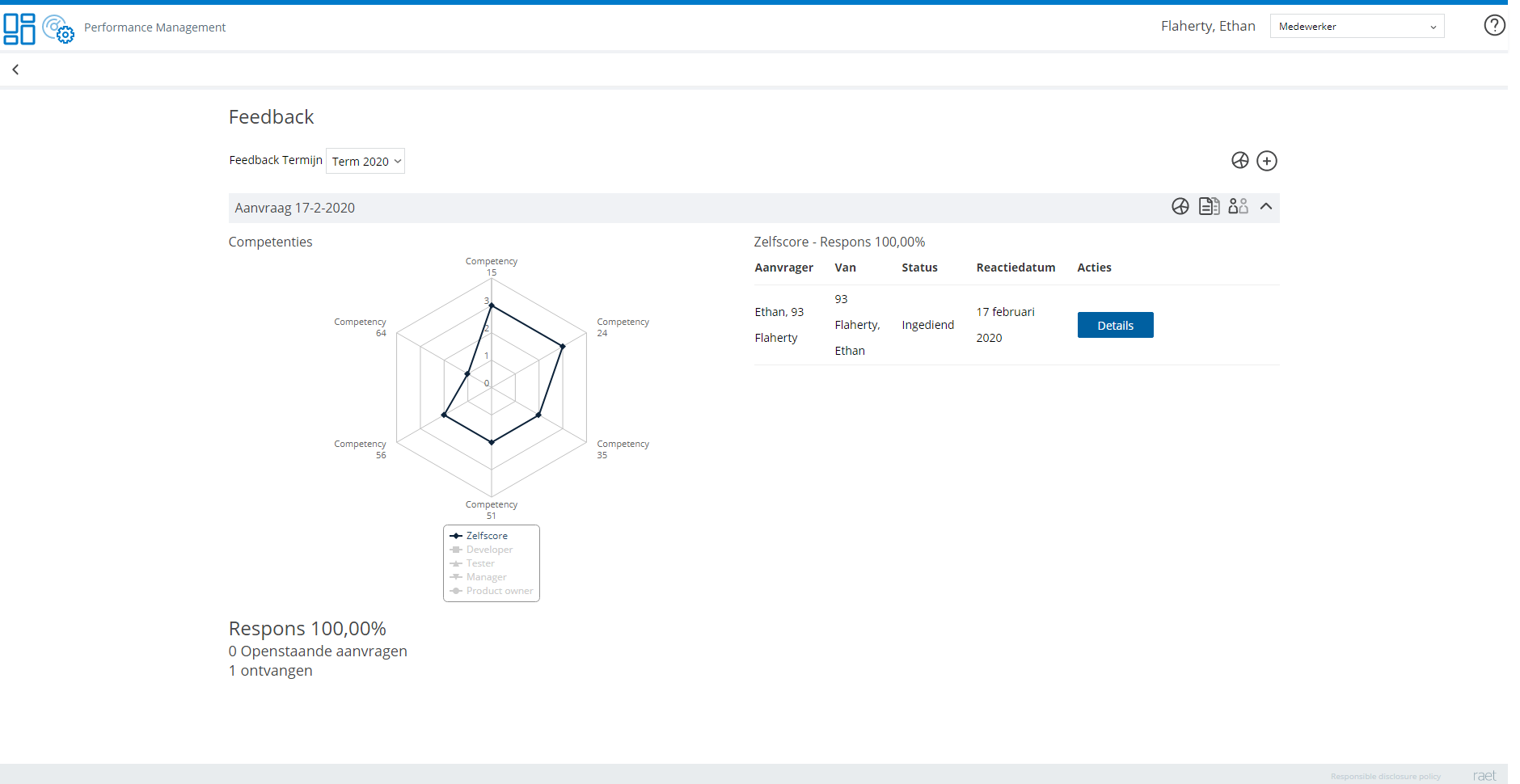
To get a good idea of the new look and feel please find below some screenshots of relevant and most used screens.
Manager landing page
Employee landing page
Employee review cycle
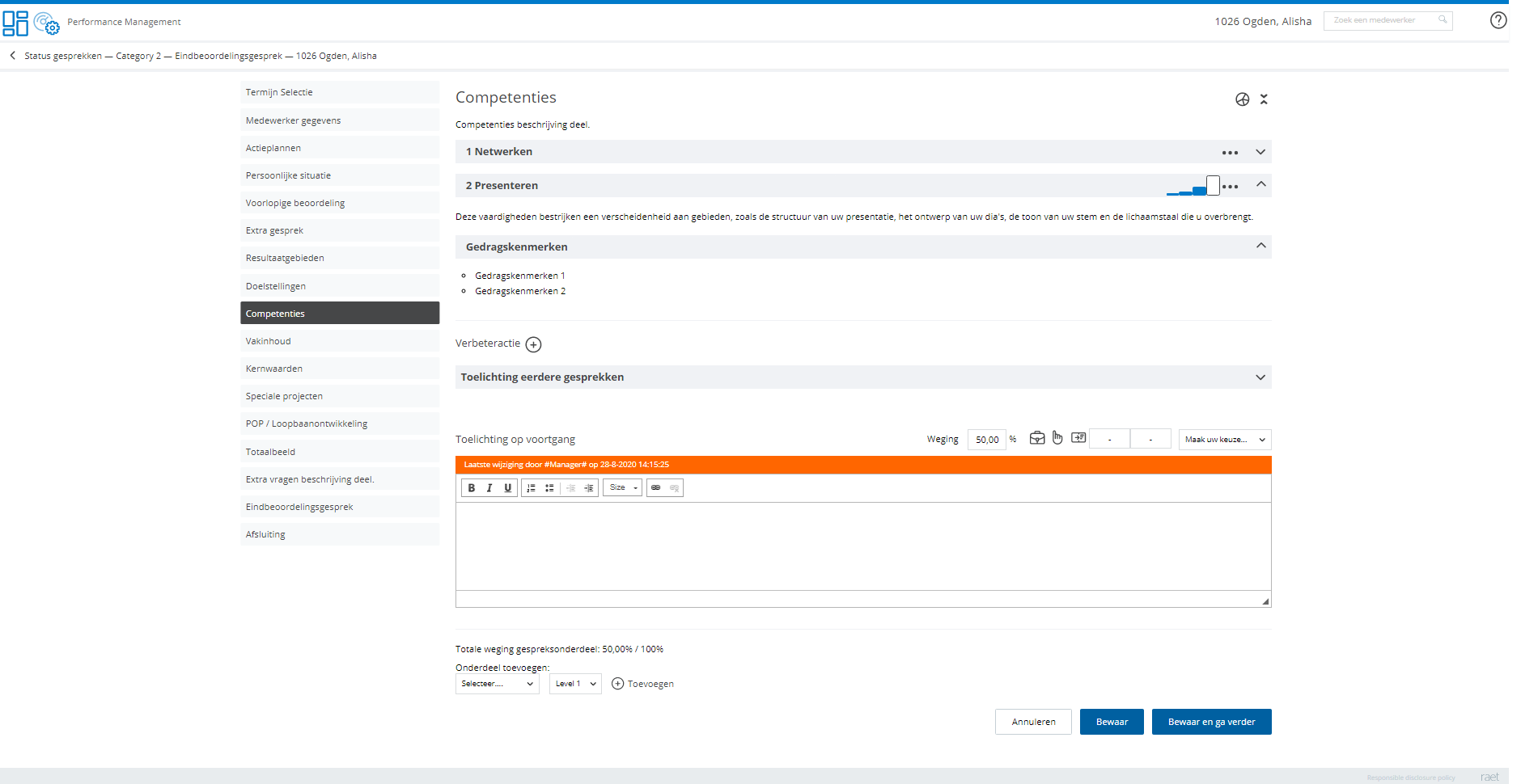
Competencies in HR Cycle with TMA
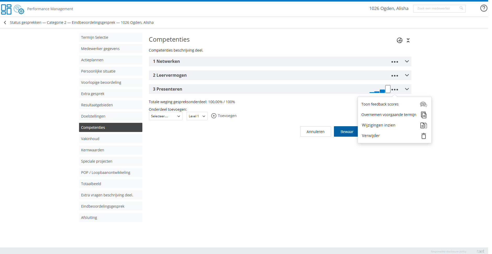
Competency details in HR Cycle with TMA
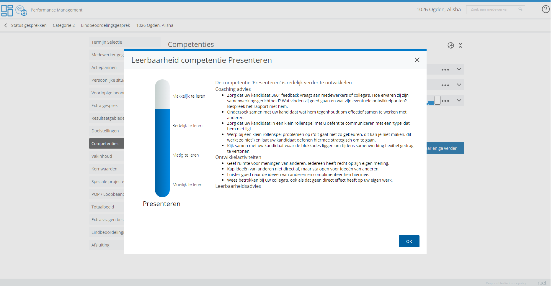
TMA learnability popup
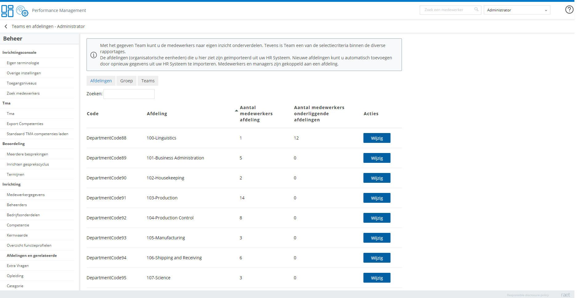
Administrator settings
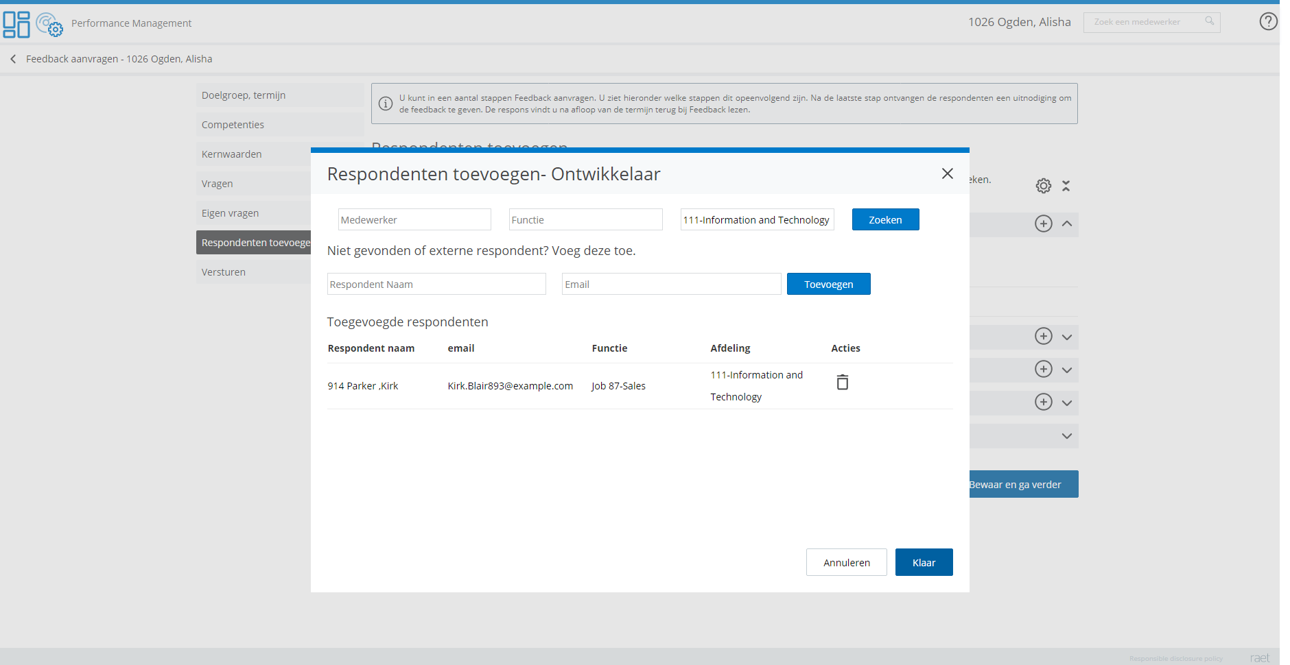
Pop up feedback respondents
Feedback request
Employee feedback
Publishing Date : 9/14/2020
Over Visma | Raet
Copyright 2019 Visma Community. All right reserved.
